Graphic Design
Rosehill bakes
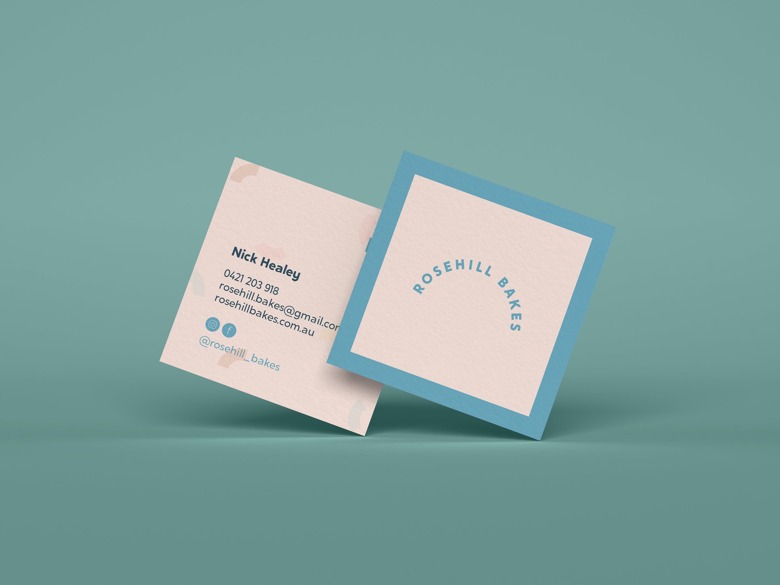
Kelly designed a rebrand for Rosehill Bakes, centred around the cake designers’ signature style as well as the bakery’s location on Rosehill Street. The color palettes accentuate the blissful feeling that baked goods bring to a special occasion, often the center pieces of table design and celebrations.
The icon and logo type are a playful take of the name, emphasizing the ‘hill’ in the curve of the type and the arch in the icon.


Neart Tide Distillery
Kelly designed the packaging and identity design for Neart Tide Distillery, a boutique distillery from Portland, Australia.
The branding concept is focused around the phrase 'neart' meaning strength. The lunar cycle iconography draws reference to the strong connection between the moon and tides, with the central moon icon showing the pull the moon has over the ocean.


Gingerbread House Kit
Packaging illustration for a Gingerbread House Kit.

